Welcome to Take Cover! This week I took a trip into the wonderful world of the Sega CD to find the ten worst covers it had to offer. With covers like these it’s no wonder the Sega CD failed. In case you were wondering, the video above is my favorite thing to come out of the Sega CD. And if that video didn’t satiate your desire for Sega CD. You can always hit the jump below to see the Top Ten Worst Sega CD Covers!
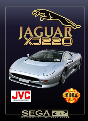
10. Jaguar XJ220
How fucking lazy is this? A stock image of a Jaguar on the cover of a game named Jaguar? Not only that but it‘s just parked there. They could have at least taken a picture of a car being driven. Or at the very least a fucking background other than black. Nope it’s a Jaguar floating somewhere in subspace.
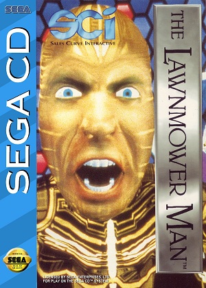
9. The Lawnmower Man
This looks like a high school photoshop assignment. Why didn’t they scale the face down in order to fit on the head? When I see this I don’t think of Lawnmower man, I think of King Tut. From this day forth I will call this game The King Tut Man, not The Lawnmower Man.
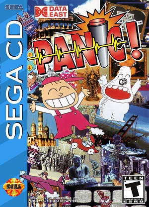
8. Panic
What four year old drew this crap? It doesn’t even fit with the rest of the box art. It’s like the artist took it home to work on it and his kid drew all over it. And seriously, what is that white thing? Is it a dog? A ghost? Either way it’s shitty.
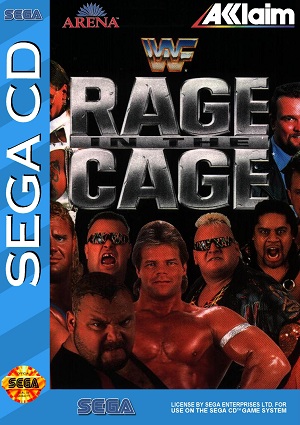
7. WWF: Rage in the Cage
I don’t think I’ve ever seen so much testosterone on one box before. It’s like a biker bar threw up on paper. Do you want a game that will put hair on your chest? A game that will make you the talk of the trailer park? Look no further than Rage in the Cage. I think this game would go hand in hand with a three wolf moon shirt.
6. Radical Rex
Oh the Nineties. It was a simpler time. A time when being radical, tubular, and totally awesome were all a person needed to be happy. But then the corporations moved in and farmed it to extinction. That’s all I think about when I see this cover. I imagine a board meeting somewhere in Activision’s headquarters. The top executives brainstorming about what is popular to kids. Someone suggests dinosaurs, while another suggests the word radical. That’s when it hits them. Dinosaurs plus radical equals Radical Rex, or money. This is one of the most obvious examples of market research studies I’ve ever seen.
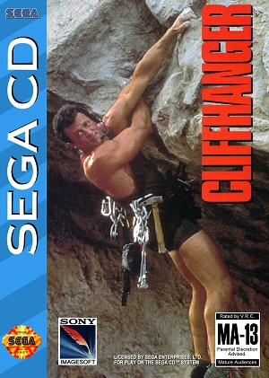
5. Cliffhanger
It’s admirable when a cover is so honest. There is a cliff and he is hanging on it. But this is just such a horrible picture that it had to make the list. Take a look at Stallone’s face. Could he be any less interested in this photo? Now I admit I don’t know a lot about climbing. But does he really need a utility belt on par with Batman’s to scale this cliff? It just seems to me like all of that added weight would make it harder.
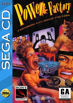
4. Power Factory
WTF is this game about? Just a quick glance at the cover leads me to believe it’s about a kid driving a controller really fast. Along the way, he encounters monsters, Michael Jackson’s face, two dudes, and some mime. The thing I really don’t understand is how disproportionate his face is. Is that a young Jay Leno?
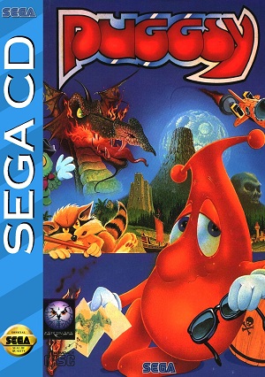
3. Puggsy
This may be the most depressed-looking mascot I’ve ever seen. He reminds me of a mall Santa. It’s like he is a middle-aged hero just taking whatever job comes his way. Save the planet from a floating dragon’s head and a raccoon? Sign me up! I will do anything for a buck at this point.
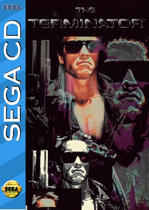
2. The Terminator
Do you know what’s cooler than Arnold? Four Arnolds! It’s not even a different picture of him either. The worst part of this one is the picture of Arnold in the bottom left. The extra part of the photo wasn’t taken out so it covers 30% of the Arnold next to him. How hard would it have been to cut that out? They did it to the rest of them so why get lazy on that one?
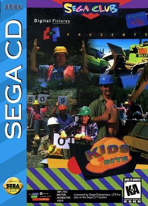
1. Kids on Site
Is it really safe to have children on a construction site? Well, I think it’s safer than letting your kids hang out with these guys. The guy with his thumbs up has the biggest pedosmile I’ve ever seen. How about the hobo hanging out in the crane? His legs are just a bit too wide open for my comfort. While we can only imagine what the guy at the top of the picture is suggesting, I think he is saying: Seriously, it’s this big. And what are the score cards for? Some kind of child labor beauty pageant? All innuendos aside, at least this NAMBLA-sponsored work site is an equal opportunity employer.
Honorable Mention
Third World War
So far I‘ve stayed in the realm of American cover art only, but I just love this one so much I needed to share it with you. Just in case you were wondering, yes, that is Saddam Hussein shaking Bill Clinton’s hand. But not only does the cover feature that. It also appears that the planes are flying right into those buildings. In case that wasn’t enough WTF for you. According to this cover the Earth is not blue, but is actually red. Who knew?
It’s been an interesting Take Cover. We’ve talked about everything from mall Santas to NAMBLA. What awaits you next week you ask? Well I’m going to do something I’ve never done before. I’m going to write an article about good covers! Check back next week to see the ten best Genesis covers!

