Here at Take Cover I do a lot of trash talking. I don’t want people to think I’m a snob or anything, I just don’t like things that suck. In an effort to prove I have emotions other than angry, I will be doing something I’ve never done. Talking about 10 covers that rule! Can you handle 10 covers this amazing? Hit the jump to see the 10 Best Genesis Covers and find out!
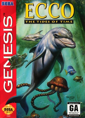
10. Ecco: The Tides of Time
For me the only enjoyment I get out of Ecco games is exploring the oceans. I find it really peaceful and usually very beautiful. This cover matches the feeling I get from these games so well. Good use of shadowing and lighting to make it look like its underwater. The diversity of animals is also a big plus. Say what you will about the games but they definitely have some peaceful environments.
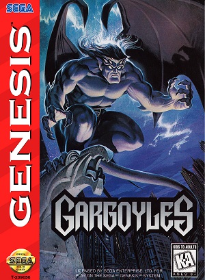
9. Gargoyles
That’s a pretty sweet looking gargoyle. I always thought the gargoyles cartoon show that this game is based off of had some pretty weak character designs. The fact that this cover takes those concepts and improves on them is really impressive. The dark colors work with the expression on his face to set a serious tone. The angle it’s drawn at is also a good choice. It makes him look like he is ready to attack you.
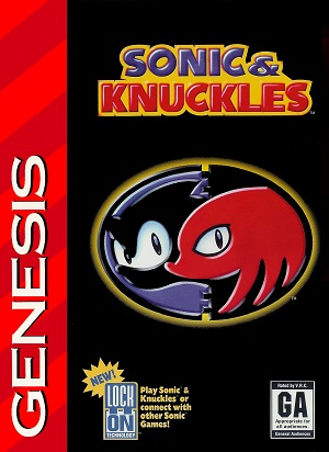
8. Sonic & Knuckles
This is a shining example of less is more. The simplicity and the contrast of colors sell this for me. The logo is well designed and has always reminded me of a Yin Yang. As I mentioned in the forums, when I was 8 I was sure that I would get this as a tattoo. Fortunately I have yet to do so, but I wouldn’t rule anything out.
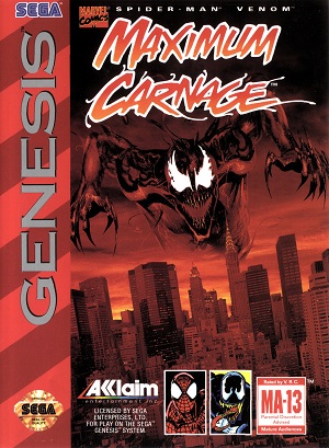
7.Maximum Carnage
I admit I don’t know much comic books. However, this shit is awesome. I’ve never played the game but after looking at this cover I’m intrigued. I’m assuming that’s Carnage over the city? His face is menacing and so are those teeth. The color scheme is really nice as well. The colors work well in combination with having him float over the city. It really sells the theme of this villain terrorizing the citizens. I will be buying this game now based solely off of the cover.
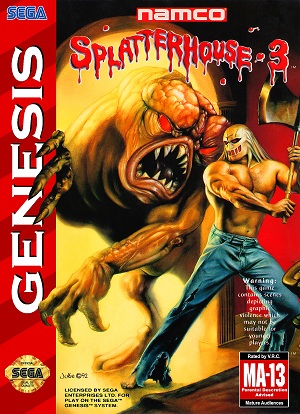
6. Splatterhouse 3
This cover exemplifies the reason why I play Splatterhouse games. I like to kill crazy looking shit with axes. The design of the monster is top notch in my opinion. It’s creepy and looks like it wants to fuck Rick’s day up. I really enjoy the design of the Terror Mask in this as well. It makes him look like The Predator, which is awesome. If someone would mod Splatterhouse so I could play as The Predator I would love them forever.
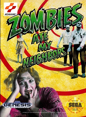
5. Zombies Ate My Neighbors
The main thing I like about Zombies Ate My Neighbors is how goofy it is. I always got a 50’s Grease vibe from the game and this cover helps sell that. I really can’t articulate what it is about the cover that gives me that impression either. Maybe its the color palette of the women in the front? I know the font of the title has something to do with it. At any rate the game is goofy and so is the cover, perfect match I think.
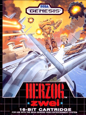
4. Herzog Zwei
It’s a shame this game isn’t more well known. It basically birthed the RTS genre alongside Dune 2, AND the cover is awesome. I really like the perspective it has. I feel like I’m right alongside the action. Lots of explosions, a huge robot, a tank, what else do you need? The colors are bright and I like the contrast between the Jet Plane and the robots.
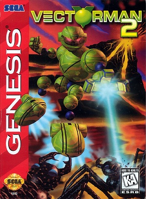
3. Vectorman 2
I usually hate when people design characters out of nothing but balls.
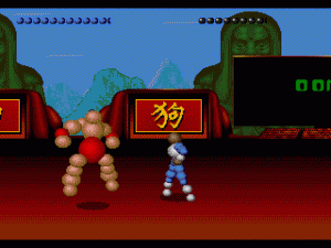
I don’t know what it is about Vectorman but I wouldn’t want to see him any other way. He looks pretty serious on this cover. I like how they have him mid jump. Shooting an ant with his laser with one hand, and about to punch the other one with his opposite hand. That is pretty bad ass. The sideways exploding volcano is little weird though. If I had to imagine what he was thinking, I would guess: Who’s awesome? I’m awesome!
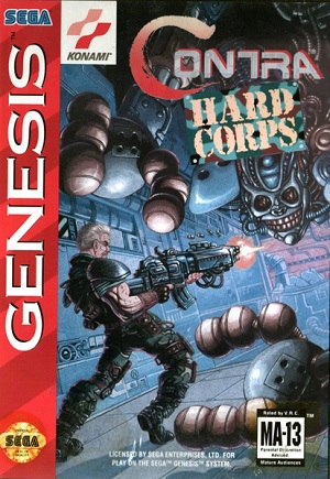
2. Contra: Hard Corps
This cover screams Contra. Buff guy with a huge gun shooting an alien and/or robot. That robot he is fighting is pretty menacing as well. Who would design a robot with a face that terrifying? If I was going to make a robot that I could destroy stuff with, I would make it a hot chick bot. That way people wouldn’t expect it to kill them. There isn’t much to say about this cover. It suits Contra perfectly.
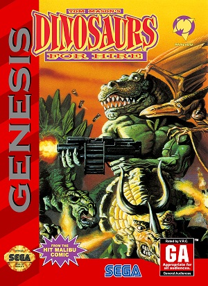
1. Dinosaurs for Hire
Holy shit! That’s a T-Rex with a huge gun blowing some stuff up! Look at the veins in that T-Rex’s arm. As if a normal T-Rex wasn’t strong enough looking right? I miss the 90’s so much when I see things this extreme. Is that Triceratops shooting lasers out of his ears? I’m sorry but this cover rules, and I don’t even like dinosaurs.
There you have it! The 10 best Genesis covers. Next week will be a return to form for Take Cover, as I will be talking about the 10 worst Genesis covers. Don’t forget to check the Crappy Box Art thread on the forums for even more terrible covers!

