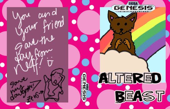
The Sega Genesis contest is over. Thank you to everyone who entered as there were a lot of amazing entries. It was hard to pick just one winner. The winning cover art is the piece you see above by RoxasEmoQueen, and was picked mainly for it’s creative “Altered Beast for girls” approach. The rest of the entries can be viewed below.
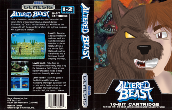
This one by CartoonistDude was one of our runner-ups. Awesome work.
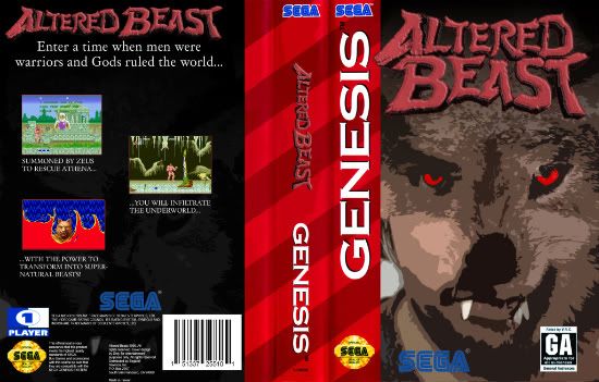
Another potential winner towards the end, this cover is by TheDrej.
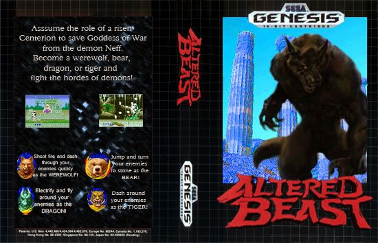
This manly entry was created by Solon S.

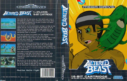
warchildpost “Welcomes you to your doom!”

Here’s lyndl’s awesome colored pencil drawing.

Gilliofrancesa turning into a manbeast.
COCK CUTLASS CONFLICT doing what he does best: growing green dongs out of his neck.
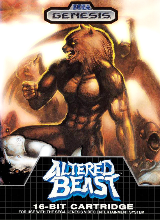
mtgtopdeck did some touching up of the original artwork.

jacksterson has a lot of kitties in his, which, is awesome.
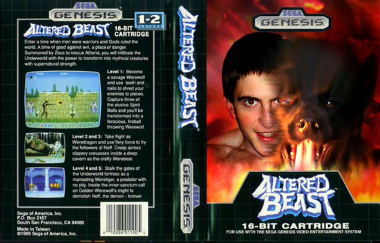
kain_kusanagi, half man, half beast.
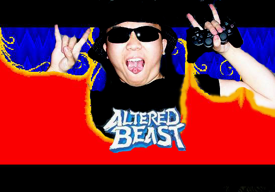
Hammershark’s entry. I am speechless.
And the last entry is segaprophet’s reworking of the original artwork.
Thank you to everyone who entered! Keep watching Sega Addicts as we’ll be doing more contests in the future.

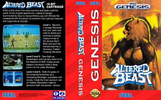

the fuck
I am questioning just why ALL Sega games didn’t come in pink and perriwinkle polkadot panels?
eeehm… the fuck
I won! I put all my favorite colors in and everything. It sucks I couldn’t make the make prettier but that’s alright! YAY! :DDD
Are we being trolled? I can’t tell o_O
That’s a little harsh don’t you think? :<
To be honest, all of the entries were pretty damn good, but this one took us by surprise. It fits the requirement of being a Genesis cover, it’s charming, and it made us all laugh. The two directly below it were also really close. I know that because we chose the cute cover, it seems like we’re not taking this seriously, but we did discuss covers for about a half hour. It wasn’t a simple choice, and we do appreciate the work you put into this stuff. Seriously, we did put a lot of time into choosing, and it was rough trying to decide who should win. In the end though, this one won the most of us over. I apologize to anyone who is offended by our choice.
xD I thought EmoQueen’s had like no chance at all, but I guess creativity can stand over skill most of the time, and as a designer, thats something I know very well. Congrats EmoQueen xD Won’t you sell me the price? haha I really really want a copy of sonic 3 😛 and mean bean machine 😛
It does not fit the requirement of a Genesis cover as it does not adhere to any esetablished rules, other than it saying “Genesis” in two places. There are no screenshots, copyright notices or generally ANYTHING that you’d find on a real genesis cover or a videogame cover in general. And if creativity was the deciding factor, how come the runner ups were the more “authentic” looking ones? I think jacksterson’s and CCC’s entries are extremely creative as well, and they did more than just “put in all their favorite colors”.
And before anyone starts attacking me for being a sore loser or something, I’m not. I didn’t even really care about the contest as such, I basically did it for fun. I didn’t even know if you guys would send me the loot if I won since I live in Germany right now. The only reason I’m writing this now is because I don’t see the logic behind Kris’ argumentation.
=´
well, I was thinking something like: What is the kind of cover I would put for real in my cartridge.
Guess I choose the wrong path. xD
drej: I know you’re disappointed, but picking it apart doesn’t really help in the long run–remember that judging is always subjective. If I had a nickel for every time I sent in a “can’t lose” animation to a festival that didn’t win squat, I’d have enough money to buy a glass of milk to cry into. Use your passion for the next contest! That’s what I do. Except I keep losing. Crap.
warchildpost: I actually really liked yours. Did you draw that logo on the back with the eyes? I would have liked to see that worked into the main cover. Nice job overall!
@Tom: disappointed isn’t even the right word I think. It’s more like “dude, wait…what?” or just simply “the fuck?” and like I said, Kris’ explanation didn’t really help with that. But whatever. Now I know what counts around here and I’ll try and use that in the upcoming contests. Assuming of course that I possess all the required assets.
@warchildpost: I really like your cover as well, it’s a very original and refreshing design. Everyone keeps focusing on the “beast” aspect of the game and not on the source material (ie, greek mythology), so that’s really a sweet idea. If I saw it in a store I’m pretty sure I’d pick it up.
Fair enough. We just want people to have fun with these contests—taking them so seriously is missing the point. I’ve tried to tailor-make cartoons for judges that I thought they’d like, and they fail every time in comparison to the “just playing around” cartoons I’ve submitted.
That’s all this site’s about–let’s just have fun! ^_^
I was just having fun. I thought that maybe transposing the manly boyish theme of the game with a more girly/ childish charm to it would be fun. I looked at all the submissions and also realized that everyone just took a regular old Genesis cover and put their own artwork. So I thought why not add to the charm and unleash my girlish wisdom on this bitch. I wasn’t trying to “steal” anything, I was just trying to have fun and being a minority in the gaming niche it’s hard to truly express yourself sometimes. I actually really liked yours drej and I was surprised myself when I won. I thought yours or warchildpost’s submission would win but I guess not. :T
@Tom: the logo in the back cover is the header of the old arcade machines. Tnks dude
@Drej: Tnks =D
Hehe, no problem dudes.
Just that is a lil awkward the concept of fun and seriously.
I think that is not the point.
I take the contest seriously but I have fun doing a cover to a game that I like.
I take it seriously when I do a research to make something that respect all the aspects of the game and why he is a classic. You know, Altered beast is a bad game. He had the difficulty of an Arcade game in a home console game. The coin maker thing that make you die easily with the damn hard gameplay. But zeus calling you, all the voices, the transformation… damn. its so cool. xD So, doing the research beyond all the platforms was serious but still fun.
The main problem was that the contest description was vague.
What do I mean?
“So, create some artwork, post it in the comments below,”
It was just that. So anything could pass through the mind of anyone.
Roxas do it, post it and win. No problem. =)
But somethings we must have in mind:
Retrogamers tend to be old school (sure), so if in the contest was something warning since the beginning how the process of selection would happen like:
“you can send anything, even a drawing made by your baby. We gonna choose what make us happy and not your ability to craft an image, draw, research or concept. It is all based on what we gonna like at all. Reminding that it is a cover art to THIS cartridge pack that is missing one, and not a cover art for the Altered Beast game at all. So do not need logos, code bars, or any ‘legal’ stuff. Unless you wanna put it. It is all up to you. And what you all have to focus is just Creativity.”
Would be more fair.
So the thing “take seriously” or “have fun”
has not to do with it. Since we can do it both.
The fact is:
“to take it personal”
or
“to just think ‘well, I participate at all, thanks for the chance'”.
In my case, I have to thank you guys for the chance, but next time make us understand pretty well how it gonna works. Surprises like that make some fans and all his efforts and expectations sink deeper.
And to finalize:
1- Congratz @Roxas o/
2- Have a nice life together Alex and Allison. Wish good thing to your life and this new level. =)
3- tnks everybody who like what I did. =D
4- drej, now just relax dude. I understand you, but it is over now… lets drink some beer and play some Altered beast hehehe xD
See yah. =)
Have a nice day.
Thanks warchildpost. We should have been a bit more specific in giving people free reign as to what to do. This is our first contest, and we appreciate your feedback. We fully intend to do more and better contests in the future, and we’ll definitely use your suggestions. Thank you very much for the kind words and recommendations!
Well said, Kris!
Just to clarify my words: taking something personally IS taking it too seriously. We’re not out to bruise anybody’s ego–all I’m saying is that if you’re getting your pride caught up in the contest, you’ve already taken it too seriously and you’ll miss the chance to just have fun just sharing artwork and ideas with other Sega fans. That’s what it’s all about. Like the hokey-pokey.
Anyway, thanks to everybody who participated! Group hug!!!
Now I get you Tom.
You have an awesome portfolio dude.
Thanks, man! I appreciate that! Are you on DeviantArt, too?
Thanks again for your participation, too. We’re all really grateful for our fans, and we’ll do our best to make the podcast and this site fun for all our fellow Sega nuts!