So it’s the early 1990’s and it’s your job to sell a lot of gaming computers, but you can only do one thing to build interest in your machines. Do you:
a) Launch some radical ads in magazines and on T.V?
b) Get a bunch of celebrities to endorse your games?
c) Set up interesting viral marketing in large cities?
d) Design a mascot, put him in a generic platformer and hope that’s all it takes to make a video game?
If you chose “d)” congratulations; you’re essentially equivalent to the guy in charge of marketing the Amiga A1200. For those who don’t know, the Amiga A1200 was a gaming computer from the early 1990’s that didn’t do as well as previous Amiga models had done. This was mainly because of the 16-bit gaming wars of the day, and also because few retailers actually carried the machine. You might be wondering what this has to do with Sega, but don’t worry, it’s totally relevant. Zool was created to rival Sonic, but unfortunately the little blue bastard was more popular. Naturally this game was ported to every other system available, including the Game Gear, Master System and the Genesis (I only talk about the Genesis version), because in the 90’s mascots = cash. So how does Zool stack up as a platformer? Given the title of this article the answer should be obvious, but hit the “more” button to find out.
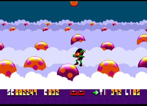
The first problem with this game is determining what the hell Zool is. Apparently back when this game was released many reviewers thought it was supposed to be an ant. The company actually had to make a press release telling everyone what the hell it was. This poor guy was doomed from the start. I don’t know why everyone saw this guy and thought “ant!” – it only has 4 legs. I wonder how those reviews went, probably something like: “Zool, for the Amiga, has you playing as a 4-legged ant-guy…probably. This angry amputee is Amiga’s answer to Sonic ‘the able-bodied’ Hedgehog.” Perhaps what’s most interesting is that nothing about the game actually makes it obvious what the guy is. I mean Sonic can easily be determined to be a hedgehog because the game tells us that is what he is – Sonic the Hedgehog. Awesome Possum. Bubsy the Cat. Zero the Kamikaze Squirrel. Aero the Acrobat. Even the shitty ones seem to get it right. In reality, Zool is a gremlin. A gremlin. Really? Is that a symbol that is common enough to be easily recognizable? Obviously not. So by this point my expectations were pretty low.
The concept of the game is essentially you have to collect a certain amount of things and then find some weird coin. In the first world the things are different types of candy, in the second they are things like CDs, vinyls, headphones. Doing all that advances you to the next level. The problem is that in some levels these items are ubiquitous while in others they’re rationed out by the government like it’s Soviet Russia. There seems to be no pattern for this distribution either: level 2-3 has these items all over the place, but the level directly before it doesn’t seem to have any. Maybe that particular level was just designed really poorly.
As it turns out, low-quality design is a theme with this game. The levels are laid out very poorly and often the environments have so much stuff going on in them that it’s hard to notice enemies or spikes or even the things you need to collect until you hit one of them face-first. Everything blends into a visual cacaphony which is not made easier to see in any way by the fact that the camera is zoomed in way too closely onto Zool. You can never be sure what’s going to be below you when you make a jump off of a ledge. Oddly enough there doesn’t seem to be any bottomless pits in this game, so it’s rarely an all-or-nothing risk, but it still sucks to land on spikes, or something that springs you up again so you have to repeat the process.
The levels themselves are not very well planned either. Usually going left-to-right is not enough; you have to arbitrarily move up or down a few platforms as well. The only thing to guide you toward the coin is a little arrow that isn’t very noticeable. Nothing indicates where the little things you need to collect are, so you pretty much have to scour the level or hope you happened to grab enough of them on your way to the coin. The overall layout of the levels doesn’t feel very intuitive and it’s easy to feel lost. Sure, sometimes you get lost in good games like Mario or Sonic, but notice the keyword: “sometimes”. In Zool you’ll probably never know where you are, at least I never did.
This game is extremely difficult – I could only make it to zone 2 – but the reason for this is because of how bad the game is. As I mentioned, the levels are best described as a rainbow-coloured clusterfuck and the camera makes it impossible to see what’s coming (not that that would be entirely possible anyway). The controls are also terrible. This doesn’t become terribly apparent until the second world when the game demands some precise platforming. Basically this gremlin is all hopped up on sugar because he never stops the way you want him to. And if you’re like me and you tend to hold down the jump button until after your character lands you’ll find another problem: if you hold down the jump button you will continuously jump. That’s a pain in the ass. What makes it worse is that I’m pretty sure in order for that to happen it has to be specifically programmed into the game. That is there on purpose.
I don’t mean to keep coming back to the non-gaming parts of this game, but there’s just so much wrong with it that it’s hard not to. You know how most games have an opening cut-scene that explains what is going on in the game? Well this game has one too, but it does nothing to explain what’s going on. It does do a lot to confuse the hell out of the player though. What happens is Zool is riding through space in his spaceship when he is apparently attacked and has to crash-land on some planet. He deduces that “Krool” did this. That’s all that happens. Who is Krool? I have no idea; much like the true identity of the game’s main character this information was judged to be not relevant enough to be disclosed. Another weird thing is for some reason they decided to type out the sound effects instead of actually making them. There is only one sentence in this whole scene and it’s the one that blames Krool for the act – the rest is just written sound-effects. I guess that makes it pretty easy to translate, but still, that seems really lazy on the developers part. On the upside though, the theme song is probably one of the best from the 16-bit era. I’m not even exaggerating – this song is delightful and it almost makes up for the failures elsewhere in the game. Overall the music is pretty good, but this song in particular is spectacular.

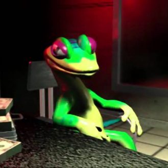
Glug? The guy was obviously drinking and driving - Krool didn't do anything. Krool probably doesn't even exist.
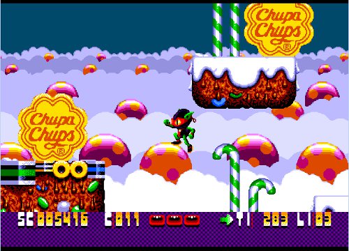
Finally, for some weird reason, there are product placements galore in the first world. Apparently when you’re the guy trying to sell suckers, and you consider the 4 options I listed before, you’re more inclined to choose a hybrid of options a) and c) except your radical ads aren’t radical and instead of being in a magazine or on TV they’re just in a game. And “viral marketing” might not be the best term. Something like “malignant tumor marketing” might be more appropriate. Those signs are so frequent that it is possible, even with the shitty zoom of the game’s camera, to see several at once. Observe:
The best part is Chupa Chups are specialty candy – they aren’t available at most grocery or convenience stores. You would most likely have to go to a specialty candy store to buy some. This is the most ridiculous product placement I’ve ever seen in a game.
To sum it up really simply: the only reason you should ever play this game is because you don’t believe that all the weird things that I’m talking about actually happen and you need to see for yourself. There really are several hundred ads for an obscure candy most of us probably haven’t eaten, let alone heard of. There really is no indication who the main character is supposed to be. The controls are garbage, the levels are unintuitive, and the music…the music is actually pretty good.
Before you go, in honour of the shameless product placement in this game for the next few weeks I’m going to be talking about advergames! Cool Spot, a bunch of McDonalds games, Chester Cheetah and more will be included in the fun. If you have any advergames or games like Zool with terrible product placement that you want me to tear up, recommend them to me in this thread, or in the comments below. Thanks!


All things considered though, I still think Zool is my favorite Ninja Gremlin chupa-chups shill.