Welcome to the first installment of Take Cover! The weekly art critic feature here at Sega Addicts. Every week I pick ten covers and either complain about them or talk about why they rule. This week I suffered through the worst the Master System had to offer. It was difficult picking only ten because so many of them are terrible. What atrocities await the brave souls who venture forth? Hit the jump and find out!
10. Michael Jackson’s Moonwalker
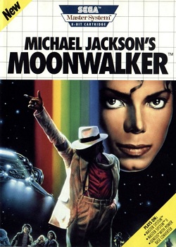
Where have I seen this before……
So this is basically a Star Trek rip off. That aside look how damn creepy his face is. Its like one of those pictures that no matter what angle you look at it from, its always looking at you. Was it designed like this so that Michael could look at all of the children while the box hung in Toys ‘R’ Us?
9. Wonder Boy 3: The Dragon’s Trap
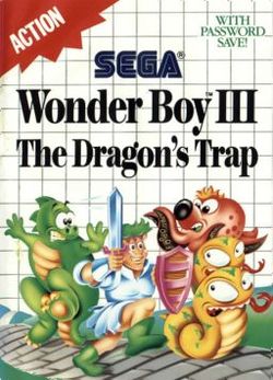
What is going on with this one? Is the hero frolicking along with the enemies? Last time I checked chief you are supposed to kill the bad guys, not dance to Oz with them. Also is that a toga hes wearing? My favorite part of this one however is the shrugging Octopus in the background. I imagine he is wondering why the hell he is in this picture. Last time I checked octopuses lived in water.
8. Black Belt
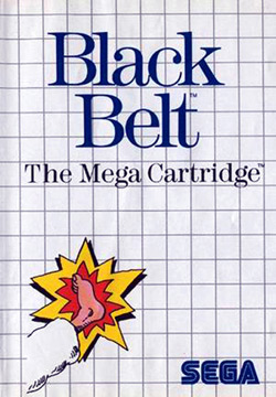
Really guys? This is just plain dumb. Why didn’t they just slide the leg a half an inch over to the left? Unless you actually play as half a leg this is inexcusable. This game should be called Exploding Half Leg, not Black Belt.
7. Alex Kidd in Shinobi World

So much to bitch about with this one. First of all, I will never remove the image of that sun from my brain. I’m tortured by it every night when I try to sleep. Its like its laughing at me, STOP LAUGHING AT ME! Secondly, check out the mullet on the rocket launcher guy. You only see hair like that in Walmart. Maybe that’s where he got the rocket launcher? Lastly whats going on with the pony tailed guys knees? Its like he is smuggling bananas where his lower legs should be.
6. Ghost House
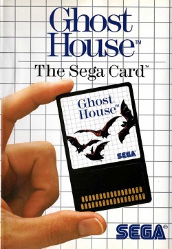
This is the laziest crap I’ve ever seen. How were people cool with this back then? You know its a crappy cover when the best part of the image is the quality of the fingernails. Damn those are some nice cuticles.
5. Pro Wrestling
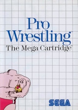
I admit I don’t know much about wrestling, but when did this shit start happening? I would absolutely watch wrestling if this kind of stuff occurred. Really what were the artists thinking. That nobody would notice he didn’t have a head? Damn they must have thought we were stupid. The only logical explanation for what happened here is that the guy in the picture smelled what The Rock was cooking.
4. Zillion
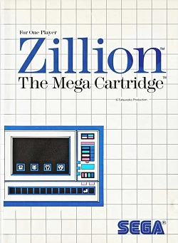
What is this? Is that a microwave on the cover? Is Zillion a game about cooking frozen burritos? Why do I want to play a game based on a common household appliance? They could have at least put the thing in the center where it belongs.
3. TransBot
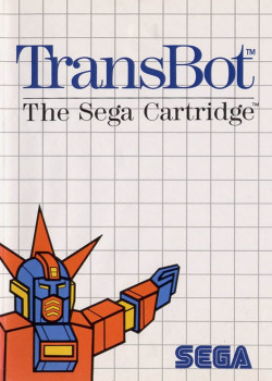
Transsexual robots saluting Hitler, really? I think I’m going to leave this one at that.
2. My Hero
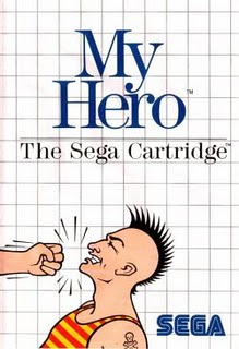
Look at this goon, this is the most stereotypical bad guy I have ever seen. Mohawk? Check. Crappy skull tattoo? Check. Crooked nose? Check. What throws it off for me however is his tank top. It looks like it belonged in Freddy Mercury’s wardrobe. More importantly though, who is the hero? The guy getting punched or the guy punching? If its the guy getting punched he is kind of a shitty hero. Maybe you play as a disembodied fist? Wait, is this the sequel to Black Belt?
1. Alex Kidd High-Tech World
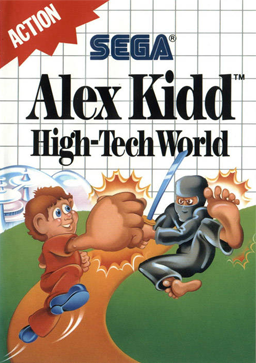
To be fair I could have probably done all Alex Kidd covers so I tried to give him a break. But this one just pisses me off so much that I had to come back for seconds. Its like the artists were making a cover for a different game. How hard could it have been? Put in some robots, maybe a flying car, a jet pack or two, and there is your cover. What did we get though? Alex Kidd fighting a ninja on a hilltop road. What is so high tech about that? Last time I checked the technology surrounding building roads was actually pretty low tech. Then when the artists realized they had made a no tech cover, they crammed that bubble crap into the background. Is that the Jetson’s back there?
So there you have it, the 10 worst Master System covers. Make sure to check back next week and see me suffer through Sega CD covers. Till then I have an appointment with my shrink, to work on getting the image of that sun out of my skull.



That Zillion cover is actually showing a screenshot from one of the menus in the game. As bad of an idea of putting a random screenshot down in the corner is I don’t know why they chose a menu rather than actual gameplay. It would at least not look like a microwave.
I’ve wondered if the crapiness of Master System art is why almost every Genesis game had some incredible fantasy style art to make up for past mistakes.
In one generation we went from guy being comically punched in the chin to Goldenaxe where all characters are on the front of the box, and one of them is a dwarf riding a goddamn dinosaur. Whatever the reason, I’m so very grateful.
Haha, I can’t believe I actually used to get excited when I saw these games in the shop when I was a kid! Seriously, I always wanted Trans Bot because I thought it was Transformers or something. In spite of its horrific cover, Wonderboy 3 is actually one of the best games on the Master System platform.