
Hello readers! Did you miss me? Take Cover is back for another week of talking smack on bad covers! This week the Sega Saturn has it’s turn. I don’t want to spoil anything, but some of the worst covers I’ve ever seen are in this weeks edition. So buckle up and hit the jump to see the 10 Worst Sega Saturn Covers!
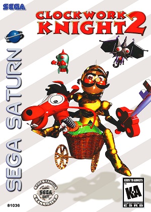
10. Clockwork Knight 2
What is he doing to that horse? Whatever it is it makes me feel dirty looking at it. Look at that face, I’ve seen mugshots with less terrifying gazes before. In his defense he does have a pretty sweet moustache.
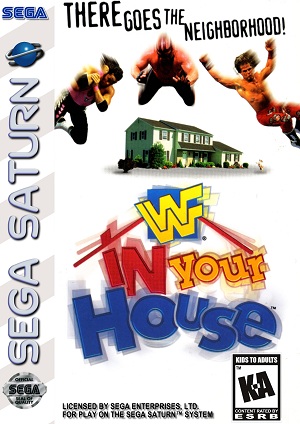
9. WWF In Your House
This must have been made the second photoshop came out. I’ve seen high school computer art class projects that looked better than this. I literally could make this in 3 minutes. I sort of wish I had whoever made this covers job. That way I could get paid to do nothing.
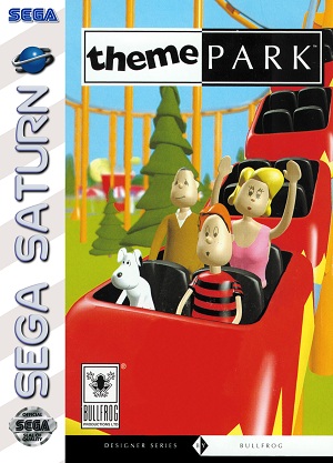
8. Theme Park
When did roller coasters get so boring? At least the woman is trying to enjoy herself. And when did they start letting dogs ride roller coasters? Why would they make a cover about a theme park with people who look like they are hating their lives. Look at the EU version of this, it’s perfect.

A bunch of screaming people on a ride is all you need. Instead we got some candy corn headed dweebs and a dog.
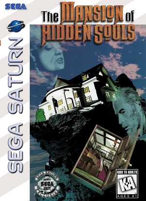
7.The Mansion of Hidden Souls
This is the most generic spooky cover I’ve ever seen. Doorway floating around? Check. Heads of old people floating around? Check. Beautiful house in a terrible environment? Check. It’s hard to think this game is imaginative, when the cover sure as hell isn’t.
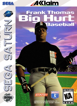
6. Frank Thomas Big Hurt Baseball
Here at Take Cover I always ignore sports game covers. They are all the same and not worth my time. This one however caught me eye. Look how far his pants are pulled up? That has to be over the belly button. If your pants are over the belly button holding a bat won’t make you look cool, nothing will. Change the name from Big Hurt to Big Doofus and maybe it will be accurate.
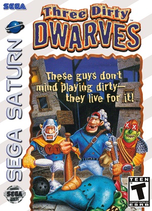
5. Three Dirty Dwarves
For three guys who live for playing dirty, they are all pretty clean. Also, a green dwarf? That’s a troll in my book, not a dwarf. Is that guy on the left holding a bowling pin? I’ve seen kids in Halloween costumes look more intimidating than this. Two redneck dwarves and one special ed troll is more like it.
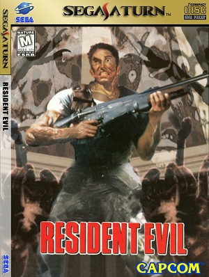
4. Resident Evil
What’s wrong with this guys eyes? He looks fucking insane. Also, what the hell is going on in the background? Are those tarantula legs or something? If someone knows please tell me because I sure as hell don’t. No zombies on the cover of a Resident Evil game is also a fail in my book.
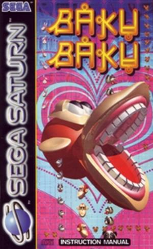
3. Baku Baku
Uh…… what the fuck is that? I think it’s a monkey, but damn is it ugly. Things like this give me nightmares. Who was making this and thought they were doing a good job? Who cleared this as the cover to the game? I have so many questions to ask the guy who made this. Mainly how he can sleep at night, knowing that this came out of his brain.
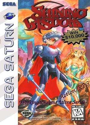
2.Shining Wisdom
Why do people smear their covers in a ton of unnecessary bullshit? If 30% of your screen is obscured by things that could just have easily been placed on the back, you’re doing it wrong. Also, I would love to win $10,000. Does anyone know how the contest worked? It would be sweet if someone had the game and could tell us in the comments. The saturation of the colors here pisses me off as well. It’s just too damn colorful.
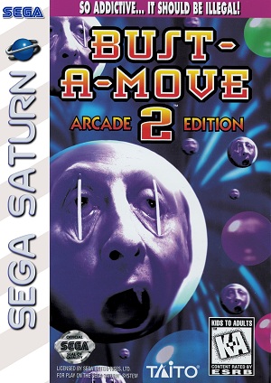
1. Bust-A-Move 2
I’ve been doing Take Cover for awhile now. I’ve seen a lot of terrible covers, but nothing tops this. I think this could be the single worst game cover ever. What are they doing to this poor guy? It looks like someone jabbed toothpicks over Moby’s eyes and told him to yawn. I’ve played Bust-A-move, when did this shit happen? I have a feeling this kind of picture is illegal in some countries.
Oh Sega Saturn, I love so much about you. Except these covers. Also if anyone has a copy of Shining Wisdom and can shed some light on the contest, that would rule. There will be a reward for those of you who need incentive other than making me happy.
Make sure to come back next week to check out the 10 worst Dreamcast covers. Also, don’t forget to join our forums and hop into the Crappy Sega Box Art thread.

Funny article, John. I’ll agree with you on most, especially Bust-A-Move (they’re all notoriously bad…remember that one with the baby tooth?), but I happen to love the Resident Evil cover (looks like some classic 80s Eurohorror, particularly The Beyond with those spiders in the foreground) and Clockwork Knight 2 isn’t that bad at all. I really like the Working Designs covers, and I do like a lot of what’s on the front of Shining Wisdom, but I definitely agree it’s busy busy busy. The background’s a little too vibrant, too, taking away from the striking pose of the two leads.
Other bad Saturn covers that come to mind:
[img]http://www.gamervision.com/images/covers/g067995oct4.jpg[/img]
[img]http://gamervision.com/images/covers/g0142830u63.jpg[/img]
[img]http://www.dawdle.com/product-image/1_787628_w200.jpg[/img]
[img]http://www.geeksetconline.com/pdshoppro/images//saturn/virtuaracing.jpg[/img]
As for the Shining Wisdom contest, you had to take a photo or video of the final status summary screen, which would list your percent completion and your total playtime. The person with the fastest time with 100% completion would win the grand prize of $10,000. They also gave away 25 one-year EGM subscriptions for the second place winners, and then for third 100 people would get a deluxe Shining Wisdom poster. Not a bad contest, when you consider that your odds would have to be pretty good considering that’s 126 prizes for an expensive, niche game on a failed system.
I was surprised this wasn’t included lol
[img]http://gamedrunk.com/wp-content/uploads/2010/03/guardian-heroes-cover.jpg[/img]
Yes! Thank you, Stooball, for reminding us all of possibly the worst Saturn cover of all time. Granted, Bust-A-Move is terrible, but whoever drew Guardian Heroes succeeded in making one of the coolest, most stylish games on the Saturn look like a pile of crap. It’s the most generic, clip-arty looking thing I’ve ever seen, and most of the Saturn covers looked like that. I would have designed them for free, just so they didn’t have to look like that.
Anyway, good article, John! Though I’ll have to respectfully disagree on Three Dirty Dwarves–the cover’s actually pretty accurate to the game’s look and style, which is brilliant. Compared to other Saturn covers, this is fine art! And yeah, a green dwarf might not make much sense, but you can’t blame the cover for representing the game accurately. Critiquing character design would maybe fall more into “game review” territory, but I see where you’re coming from. Sorry–I get kind of defensive with this game. I LOVE IT! 😀 I totally agree with everything else on your list–it’s always puzzled me how the Saturn games had such terrible covers. And that people actually got paid to make them.
“Do you think….we should freshen up a little bit….before we go?”
“NO, no time for that!”
I love Three Dirty Dwarves 🙂
I remember seeing that Bust-A-Move 2 cover at the stores when it was released. It would have been cool if it was a horror game, but when I looked at the back and saw balls I thought “bleh!…”.
Ah, 90s. The hell was going on with you?
Nice investigative work Grolt! When I figure out a prize for you I will give you a shout 🙂