
Oh the Dreamcast. I don’t think I can accurately explain the soft spot I have in my heart for you. It pains me to do this to you, but it’s my civic duty to talk smack on bad covers. Fortunately for the Dreamcast the art is almost all top notch. I think there is an It’s Thinking joke in here, but I haven’t found it yet. In the meantime, why don’t you hit the jump to see The 10 Worst Dreamcast Covers!
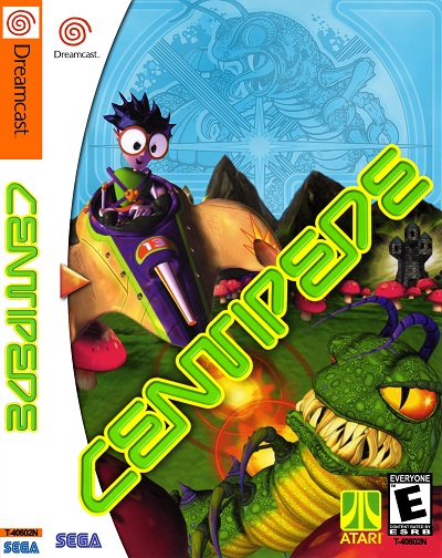
10.Centipede
I’ve been playing centipede for a long time, and I have no idea who the fuck that purple guy is. I have also never seen a Centipede with teeth that gnarly.What was wrong with the original 8 bit look of Centipede?
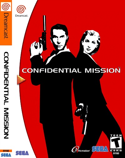
9. Confidential Mission
Is that James Bond? If not, how did these guys not get sued for this? Not only is it a total Bond rip off, but the wording on the back features an epic typo.
That should be some sort of indication about the love and dedication put into this stinker.
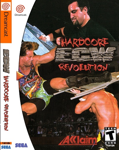
8. ECW Hardcore Revolution
What is this crap? I’ve never met anyone who thought this was cool. Who the hell wears something like that guy is on the left? Also look at his face, dude looks like Bugs Bunny.
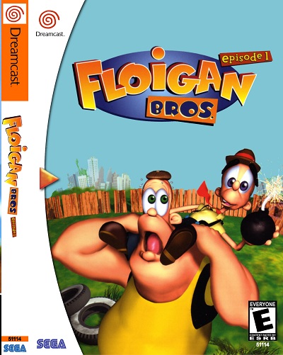
7. Floigan Bros
What am I looking at here? Is this the past time of rednecks everywhere? Riding on someones back with an explosive? I wonder how well this game sold in the south? Probably terrible because they were all too busy riding each others backs with explosives.
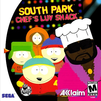
6. South Park Chef’s Luv Shack
Maybe I’m just making something out of nothing, but is anyone else creeped out by this cover? There are four children in Chef’s Luv Shack and Chef is wearing something a little too thin for my comfort. I’m not sure how comfortable I am playing a game about a man with four boys in his luv shack.
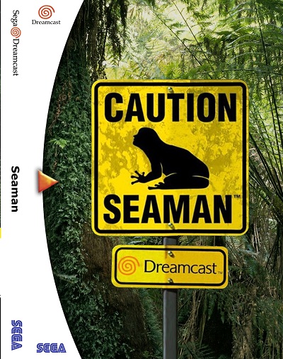
5. Seaman
Holy crap this is terrifying. I feel dirty when I look at this cover. Half frog, half man, all creepy. The only redeeming quality of this cover is Leonard Nimoy on the back.
Is he boldly going where no Seaman has gone before?
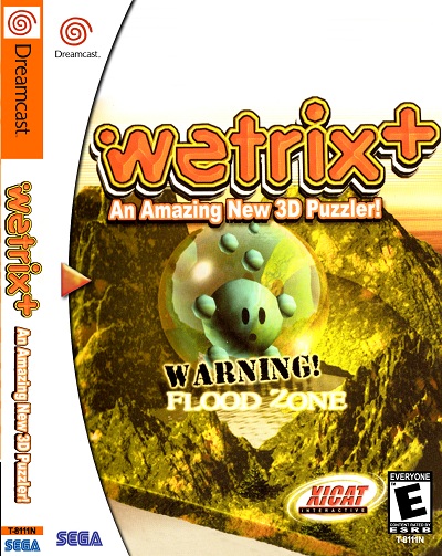
4. Wetrix
What the hell is this? Is that a bowling ball inside of a monkey ball? That sounds kind of awesome actually. Super Bowling Monkey Ball has a nice ring to it.
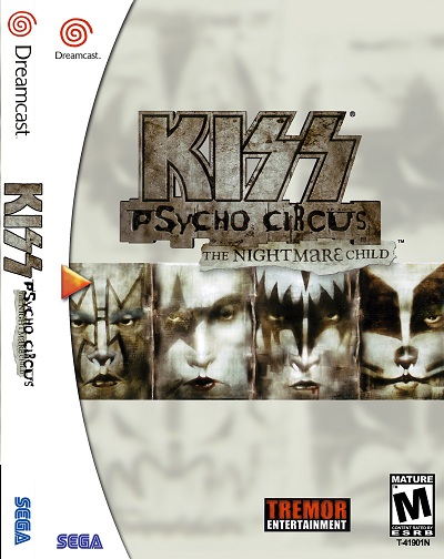
3. Kiss Psycho Circus The Nightmare Child
Oh man Kiss is so lame. Sorry Kiss fans but it’s true. Also why is this games name so long? It looks like they spent more time making the name then designing the cover. Four stock pictures of Kiss and a boring background.
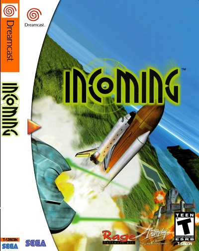
2. Incoming
I didn’t know that someone could make a spaceship so boring, but holy shit they did. Everything about this is so drab. Also, why did they make it at this angle? It almost makes my stomach sick looking at it. I think we should call this game Incoming Shit Pile of a Game.
1. Omikron
Ugh, what the fuck is this? I have seen a lot of things here at Take Cover, but this has to be the weirdest thing I’ve ever seen. I’m really not even sure what is happening here. Is that David Bowie in the center of the cover? I have an answer to the question on the cover as well. Who will you be after you die? Someone blind so I don’t have to look at this stupid shit anymore.
This was probably the hardest Take Cover, the Dreamcast had some sweet covers. Next week I have a surprise for you guys. You excited? Good!
Don’t forget to check out the Crappy Box Art thread on the forums as well!



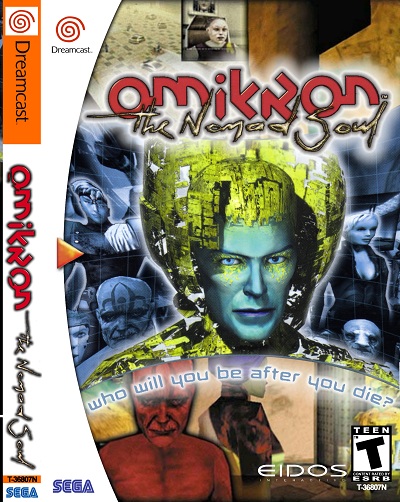

I agree with many of these but I really like the Seaman cover. Did a good job of keeping the sarcastic tone of the game. Also don’t let the horrible collaged cover for Omikron scare you away. Its my favorite Quantic Dream game and it stars David Bowie. David Bowie!
@Alex
Definitely agreed on Seaman. It’s a weird-ass and oddly funny cover for a weird-ass and oddly funny game.
The same goes for Wetrix. Don’t let the terrible cover scare you away. That is one of the most addictive puzzle games I’ve played in some time. I will grant that the cover design is dog poo, but after playing that game incessantly, I cannot figure out what they could have done to better visually represent the game. I do not envy the people who had to design something for a title like that.
Geez… Every time I say the word “game,” take a drink.
Well, it looks as if design principles improved from the Saturn to the Dreamcast, at any rate. None of these look all that bad, although definitely a major fail with both sides of that Confidential Mission cover.
I always thought these were bad:
[img]http://upload.wikimedia.org/wikipedia/en/3/38/Seventh_Cross_Evolution_Coverart.png[/img]
Droppin’ lens flares like mad, a logo bigger than the game title and just a drab, unappealing and indistinct image. Tough to believe that the graphics in the actual game are quite a bit worse than this, even.
[img]http://upload.wikimedia.org/wikipedia/en/3/33/Godzilla_Generations_cover.jpg[/img]
The first game on the Dreamcast, and despite having a Godzilla license it still wasn’t even able to get a half decent shot of the beast. Again, a major overuse of red (especially considering that Godzilla is famously green), a blurry image and a complete lack of anything else. The game was just as bad.
[img]http://2.bp.blogspot.com/_Ruf9JBv9V4U/SuDVHDSX3uI/AAAAAAAAC0Y/36XpryBp1XE/s400/Carrier_Dreamcast_coverjap.jpg[/img]
[img]http://static.gamesradar.com/images/mb/GamesRadar/us/Features/2009/09/Dreamcast%20Week/20%20kickass%20games/dceggelementalgimmickgear–article_image.jpg[/img]
[img]http://www.cheatcodesgalore.com/dreamcast/games/Elemental_Gimmick_Gear/Elemental_Gimmick_Gear-s0.jpg[/img]
whoops lol
Yeah, I almost included Carrier on my list, but I cut it a bit of slack because it did feature some bloodshed on the cover. It had some guts. But yeah, the zombie looks like someone took a 3D model, made it flat and then free transformed it in Photoshop